How to Choose the Right Colors for Your Bedroom: The Science of Serenity
Your bedroom is the most personal space in your home. It’s where your day begins and ends, acting as a sanctuary for rest, reflection, and rejuvenation. While furniture and layout are important, color is the most powerful tool in your “home interior design bedroom” toolkit. It doesn’t just change how a room looks—it changes how you feel.
Choosing the right palette can be the difference between a restless night and a deep, restorative sleep. Here is how to pick the perfect hues for your private retreat.
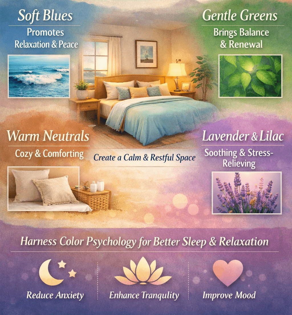
1. Understand the Psychology of Color
Before looking at swatches, consider the mood you want to create. Colors have a direct impact on our nervous system.
-
Cool Blues and Greens: These are the gold standard for bedrooms. Soft blues are known to lower heart rates and blood pressure, promoting a sense of tranquility.
-
Warm Neutrals: Toasted almond, soft terracotta, and warm greys create a “cocoon” effect, making large rooms feel cozy and safe.
-
Muted Earth Tones: Sage green or clay brown connect you back to nature, which is a core principle of modern “design interior design.”
Note: Avoid bright, high-energy colors like “Fire Engine Red” or “Neon Orange.” These are stimulants that can increase your heart rate—the exact opposite of what you want before bed!
2. Consider the “Light Factor”
The same paint color can look completely different in two different homes. Light is the “silent partner” in your color choice.
-
North-Facing Rooms: These tend to have cool, bluish natural light. To keep the room from feeling chilly, lean toward warmer undertones (like a “greige” or a creamy white).
-
South-Facing Rooms: These are flooded with intense sun. You can pull off darker, cooler shades like charcoal or navy without the room feeling like a cave.
-
Artificial Lighting: Remember to check your paint samples under your bedside lamps. Warm LED bulbs will turn a crisp white into a soft yellow.
3. The 60-30-10 Rule for Bedrooms
If you’re worried about a room feeling “too blue” or “too plain,” follow this classic design formula to balance your “home interior design idea”:
-
60% Primary Color (Walls and Rugs): Usually a soothing neutral or a soft pastel.
-
30% Secondary Color (Bedding and Curtains): A slightly bolder version of your primary color or a complementary tone.
-
10% Accent Color (Pillows, Art, Lamps): This is where you can add a pop of gold, deep forest green, or even a soft rose.
4. Don’t Forget the Ceiling (The Fifth Wall)
When you’re lying in bed, you spend a lot of time looking up. Most people default to stark white, but that can feel clinical.
For a “luxury interior design” feel, try painting the ceiling one or two shades lighter than your walls. This creates a seamless, “wrapped” look that feels incredibly high-end and relaxing.
5. Test Before You Commit
Never buy five gallons of paint based on a 2-inch paper swatch.
-
Sample Pots: Paint a large square on at least two different walls.
-
Peel-and-Stick Samples: Use modern “home interior design app” features or order physical peel-and-stick samples to move the color around the room at different times of the day.
-
Living with it: Look at the samples in the morning light and again at 9 PM.
Conclusion: Color Your Way to Better Sleep
Choosing the right color isn’t just about following trends; it’s about creating a space that resonates with your personal needs. Whether you opt for a “low cost middle class home interior design” refresh or a full luxury makeover, the right color is the foundation of a beautiful bedroom.


Add a comment